With almost every inch of New York’s West Chelsea neighbourhood now claimed, an exciting new residentialbuilding has sprouted up where the iconic Getty gas station once stood. Designed by Peter Marino, The Getty is comprised of six apartments – five full floor units and a single duplex penthouse with a roof terrace and private pool – and houses the Hill Art Foundation and the latest outpost of the Lehmann Maupin art gallery on the first four floors
In contrast to the many architectural statements that already punctuate the neighbourhood, Marino’s design for the 11 storey mid-rise building is comparatively understated. Offset aluminium and glass panels on the façade give the building an individual identity, while unique glass curtainwalls and 6.7m high corners without mullions facilitate an immediacy to the High Line located adjacent.
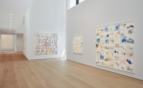
For Lehmann Maupin, Marino devised three dynamic floors, which include column-free exhibition spaces on the ground level, private viewing areas and office space on the second floor, and a black box gallery space on the cellar level for films and other special projects.
‘Each gallery provides unique views and opportunities for artists whose exhibitions vary wildly in scale and medium,’ says Marino. ‘As architect of the entire building, our approach to the gallery spaces relates to our overall design approach – to create a series of unique, variable and flexible gallery spaces – which provided a substantial expansion from Lehmann Maupin’s Christie Street location.’
‘For most of the gallery’s history, we have had two spaces in New York, in Chelsea and the Lower East Side. We came to realise you really need the flexibility and space that two locations provides,’ says gallery co-founder David Maupin, who closed the Christie Street outpost earlier this year.
‘When we learned Peter Marino was the architect [of The Getty], we were immediately interested. I’ve known Peter for over 20 years, and trust that he knows the needs of our artists and aesthetic of the gallery. Rachel and I walked up the block to see the location, and knew immediately that this prime corner was exactly what we had been looking for. The location of 24th Street is hugely significant in Chelsea with so many amazing galleries on one block. We’re among good company.’
The new and improved location not only boasts a larger square footage, but generous amounts of daylight, special glass coatings to protect both artwork and interiors from UV damage and a unique mezzanine level as well.
Marino says, ‘Our intention to bring certain elements of Christie Street into the space can be seen with the mezzanine, which the Christie Street gallery also enjoyed. The mezzanine allows the artwork to be viewed from different perspectives and provides a space for social events and openings. Each gallery provides unique views and opportunities for artists.’
He adds, ‘We intended to bring Chelsea as a former manufacturing neighborhood into the space. The solid oak floors, 12” wide, provides a consistent identity throughout all of the spaces and are a nod to the industrial heritage of Chelsea. The flooring was intentionally left natural, brushed for enhanced colouring and the edges were rounded to suggest something gently used, rather than the rigidity of something entirely new.’
In terms of programming, the new 24th street space is conceived as a standalone space, despite its 22nd street sibling being close by. Maupin says, ‘However, when it curatorially makes sense, we want to expand exhibitions between both locations. We often did double gallery exhibitions for special bodies of work in Chelsea and the Lower East Side. Our opening exhibition for Liza Lou: Classification and Nomenclature of Clouds at [the new space] will spread between both galleries as well, and now visitors can see both within two blocks walk.’
