Two days before its official opening, Lehmann Maupin’s Chelsea gallery is already teeming with visitors. Artists, employees, and friends are either prepping the space for the onslaught of attention soon to follow or admiring the newly installed works, which play with light and shadow on the ivory walls. One visitor is Liza Lou, the L.A.-based artist who works primarily with glass and beads and whose solo show will open the gallery later in the week. With a quiet confidence, Lou walks among her intricate creations lining the double-height space, her eyes bright.
The space—which officially opened today—is the fourth outpost for Lehmann Maupin, which also has locations in Hong Kong, Seoul, and another a five-minute walk away on West 22nd Street. Helmed by Rachel Lehmann and David Maupin, the gallery counts Mickalene Thomas, Marilyn Minter, Juergen Teller, and, of course, Lou among its long list of talent. AD100 hall-of-famer Peter Marino designed the space, which boasts three floors and four galleries, and totals 8,971 square feet. The building itself has a unique history; the corner lot was once a Getty gas station that was converted into a public art project once the station was vacated. Now the site is home to the Getty, Marino's sleek luxury condo project, which sits above the Hill Art Foundation and, on the two lowest floors, Lehmann Maupin. “Peter was the architect of the whole building, but he’s also a friend and a client so it was great to work with him,” Maupin tells AD PRO. “He’s an art lover, an art collector, he very much understands the interest and need of not only the gallery but the audience, and more importantly the artist.”
In a neighborhood where galleries are a dime a dozen, Lehmann Maupin’s space feels at once pristine and warm. Both Marino and Maupin note that they wished to eschew the industrial aesthetic that dominates much of Chelsea. “Chelsea is evolving from the industrial spaces we all love to include more refined and luxurious buildings (including ours!),” Marino told AD PRO in an email. He cites a curved staircase and luxe elevator as upscale touches to the space that are “a bit more luxurious but with an industrial feel.” Solid oak floors, instead of the more typical concrete seen across galleries, also add sophistication to the space. Plus, Mapuin argues, they’re more functional for the artists. “One of the reasons we have wood floors in the new gallery is because they’re so forgiving,” he says. “You can screw into it, you can pick up the planks, and it’s much more flexible for an artist than concrete. It’s very hard to install in concrete—you have to excavate or bolt something to it.”
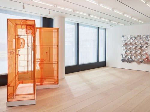
The Chelsea gallery is divided into four distinct areas that each cater to a specific type of artwork. A column-free exhibition space on the first floor with 22-foot ceilings is illuminated by an overhead skylight. The lower level hosts a black box gallery for films and other special projects. And the second floor—which offers views of the High Line—is outfitted with the gallery offices and a private viewing area, currently showing work by Do Ho Suh and Teresita Fernández. “Each gallery provides unique views and opportunities for artists whose exhibitions vary wildly in scale and medium,” says Marino. And, most importantly, it provides lighting. “For all my projects lighting and natural lighting is an essential consideration, but for a gallery it’s paramount,” Marino adds. “We designed each space with a range of opportunities, from adjusting the daylight with solar shading to several options to illuminate the room itself—to precisely light the artwork itself, creating no shadows whatsoever.”
Maupin made sure to engage the gallery’s artists with the renovation process from the very beginning to ensure that the space was practical for their work, as well as aesthetically minded. “We’ve always put an emphasis on creating public viewing opportunities for our artists, and really being artist motivated,” Maupin says. “And our feedback from the artists is that we create three or four different types of exhibition opportunities, not just one large open room.” Because Lehmann Maupin works with artists in many mediums, this is key. Mapuin notes that his artists visited the site, looked at models, and assessed schematics throughout the three-year construction process.
On a massive wall on the first floor is Lou’s showstopping work The Clouds spanning 50 x 22 feet. Composed of 600 beaded white panels that have been partially smashed with a hammer to reveal the fraying textile beneath, the effect is beautiful, fragile, and ethereal. Though the work was exhibited at the 21st Biennale of Sydney, it has never been shown at this scale. I crane my neck to see the woven painting and even take the stair up to the second floor for a different perspective. Peering over the edge, I see Lou and her cohort of friends admiring the cloud and smiling.
Visit Lehmann Maupin’s newest gallery on West 24th Street and Tenth Ave.
